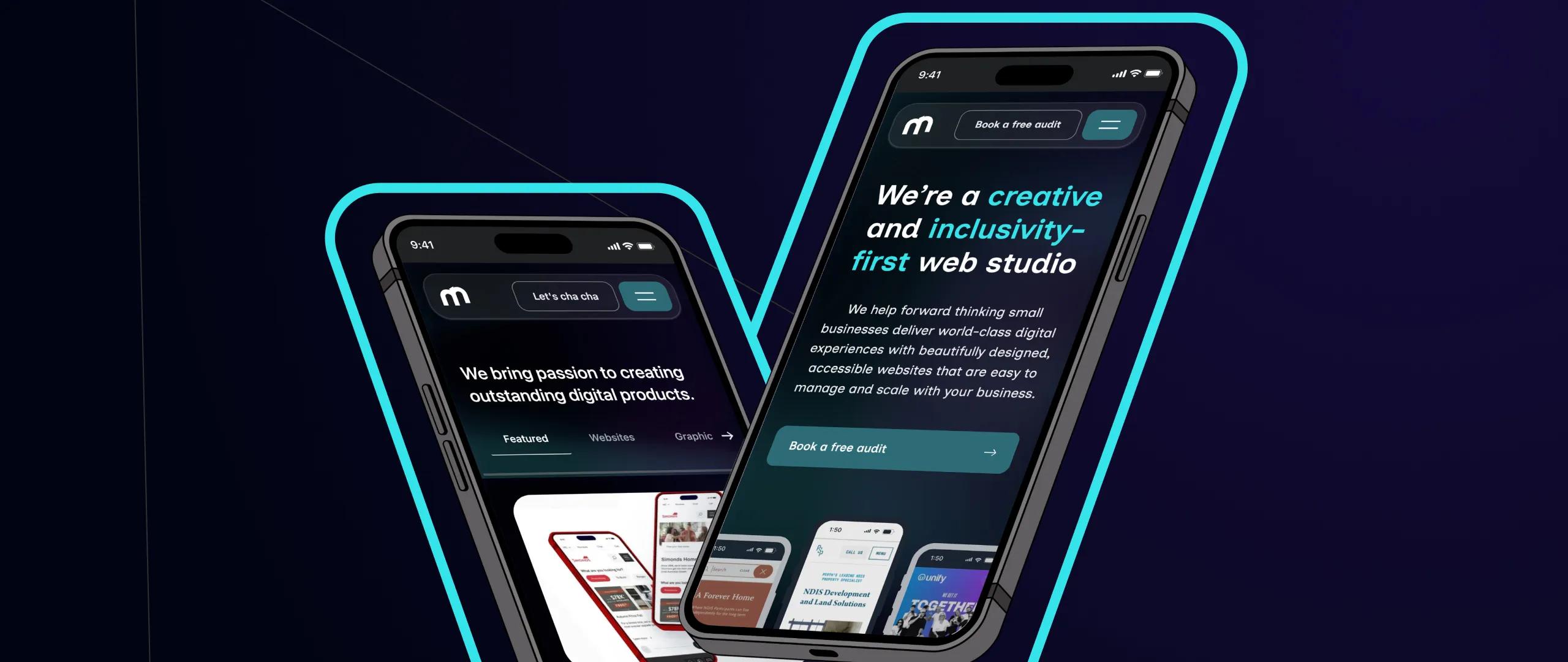
We’ve officially moved away from the fragmented WordPress hybrid and transitioned to a fully dynamic, Sanity Studio + Next.js ecosystem.
Why Dark Mode is More Than Just a Trend
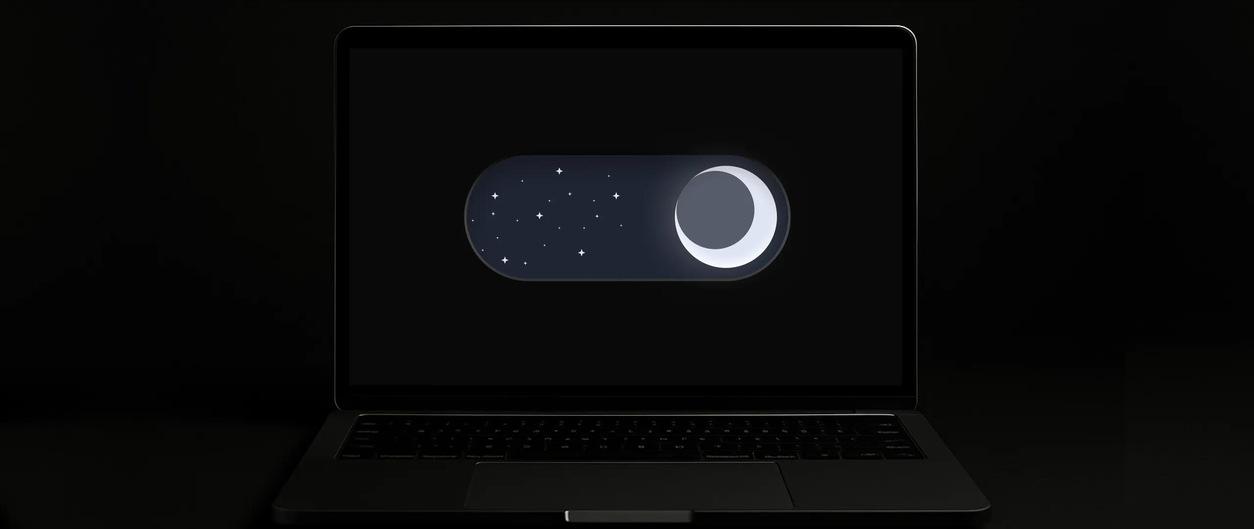
In an increasingly digital world, the demand for more comfortable and personalised online experiences is growing – and dark mode is leading the charge.Once a niche feature, dark mode, with its inverted colour scheme of light text on a dark background, has become an expected option across major operating systems and applications. It’s not just a fleeting aesthetic; it’s a significant shift in user preference driven by genuine benefits.
At Mintyy, we’re constantly analysing how the latest design trends can genuinely enhance user experience and deliver tangible value. In this article, we’ll delve into the essential design considerations for effectively implementing dark mode and explore the significant advantages it offers to both your users and your business.
The Rise of Dark Mode: More Than Just a Trend
The journey of dark mode from a developer’s utility to a mainstream preference is fascinating. Its rapid adoption isn’t arbitrary; it’s rooted in clear user demands and practical benefits.
Primarily, dark mode significantly reduces eye strain, especially in low-light environments. Staring at a bright screen for extended periods can lead to digital eye fatigue, and dark mode provides a gentler visual experience, making it more comfortable for users to browse and interact for longer durations. For devices with OLED screens, dark mode also offers a tangible benefit in battery life, as individual pixels can be turned off, leading to reduced power consumption.
Beyond the practical, there’s a strong element of aesthetics and personalisation. Many users simply prefer the sleek, modern look of dark mode. It can also help users focus on content by reducing the glare and visual clutter often associated with traditional light interfaces. The widespread embrace by giants like Twitter, YouTube, Google apps, and major operating systems across iOS, Android, macOS, and Windows underscores that dark mode has shifted from a novelty to a fundamental expectation for many digital experiences.
Key Design Considerations for a Seamless Dark Mode Experience
Implementing dark mode isn’t as simple as inverting colours. Doing it effectively requires careful planning and a nuanced understanding of design principles. Here at Mintyy, we tackle these considerations head-on to ensure your dark mode isn’t just functional, but truly enhances the user experience.
A. Color Palette Selection
The most crucial step is refining your colour palette. Pure black (#000000) can be too harsh and create an oppressive feel. Instead, we advocate for using dark grays, deep blues, or rich charcoals (#121212, #1A1A1A, etc.). These softer dark tones provide better contrast and a more comfortable viewing experience. It’s also vital to desaturate vibrant colours slightly. A bright red that pops against a white background might scream against a dark one. Subtle desaturation ensures they remain visually appealing without being overwhelming. Critically, we always ensure sufficient contrast ratios for all text and UI elements, adhering strictly to WCAG guidelines to maintain accessibility. Your brand’s primary, secondary, and accent colours need careful translation to ensure they maintain their semantic meaning and visual impact in the dark environment.
B. Typography
Typeface selection and rendering behave differently on dark backgrounds. Lighter font weights can appear thinner and less legible against dark colours, so minor adjustments to font weight or size might be necessary. Similarly, line height may need slight tweaks to ensure optimal readability. The overarching principle remains: contrast is king. Ensure your chosen typefaces and their colours provide ample contrast against the dark background, preventing eye strain and ensuring clarity.
C. Iconography & Imagery
Images and icons require special attention. Scalable Vector Graphics (SVGs) are highly advantageous here due to their inherent adaptability. For raster images, ensuring they have transparent backgrounds is crucial to avoid jarring white boxes. Some logos or brand illustrations might even require dark mode specific versions to maintain brand consistency and legibility. While shadows and gradients can add depth, they should be used subtly in dark mode to avoid overcomplication or visual noise.
D. States & Feedback (Buttons, Links, Hover Effects)
Interactive elements need to be clearly distinguishable and intuitive in both modes. How do your buttons, links, and hover effects change? We ensure that hover states, active states, and disabled states are clearly communicated through changes in colour, opacity, or subtle animations. Form fields, for example, need clear borders and distinct focus states so users know exactly where they are interacting.
E. User Control & Switching
Empowering the user is paramount. Providing a visible, accessible manual toggle for dark mode preference is essential. We also implement system preference detection, allowing your website to automatically switch to dark mode if the user’s operating system is set to it. Crucially, their choice should be remembered using cookies or local storage, so they don’t have to re-select their preference every time they visit.
F. Testing, Testing, Testing
No dark mode implementation is complete without rigorous testing. We thoroughly test across various devices (desktops, tablets, mobiles), different browsers, and especially on different screen types (OLED vs. LCD) where visual differences can be significant. More importantly, user feedback is crucial. We often conduct user testing sessions to gather real-world insights and refine the dark mode experience.
The Benefits of Implementing Dark Mode for Your Business
Beyond just being a cool feature, dark mode offers significant strategic advantages for businesses willing to invest in its thoughtful implementation.
A. Enhanced User Experience (UX)
At its core, dark mode is about comfort. By reducing eye strain, especially during prolonged use or in low-light conditions, users are likely to spend longer, more comfortable sessions on your website. This leads to improved readability for many users and contributes to a modern, sophisticated aesthetic that appeals to a wide audience.
B. Brand Perception & Modernity
Offering dark mode signals that your brand is current, forward-thinking, and attuned to user needs. It can be a powerful differentiator in a crowded market, positioning your brand as innovative and user-centric. This subtle commitment to user comfort significantly boosts your perceived value.
C. Potential for Increased Engagement
When users are comfortable and enjoy their experience, they are more likely to engage more deeply with your content. A visually appealing and comfortable dark mode can lead to longer average session durations and a greater sense of control over their digital environment.
D. Accessibility
While not a replacement for full accessibility compliance, dark mode provides a valuable option for users with certain visual impairments or light sensitivities. It adds another layer of inclusivity, making your website more accessible to a broader audience.
How Mintyy Can Help You Embrace the Dark Side
At Mintyy, we don’t just follow trends; we master them to create truly exceptional digital experiences. Our expertise in designing and implementing dark mode ensures seamless integration that respects your brand identity while delighting your users.
We take a user-centric approach, meticulously understanding your brand’s essence and your audience’s needs to craft a dark mode that feels natural and intuitive. Our technical proficiency ensures robust, responsive design that performs flawlessly across all devices, adhering to the highest accessibility standards. Beyond just integrating dark mode, we look at your entire digital presence. We don’t just build websites; we craft experiences that resonate, convert, and stand the test of time.
Take Action
Dark mode is no longer a fleeting design fad; it’s an integral part of a sophisticated and user-friendly web presence. Its ability to enhance comfort, extend battery life, and project a modern brand image makes it a valuable investment for any business looking to stay ahead in the digital landscape.
Ready to explore how dark mode can transform your website’s user experience and reflect your brand’s modern vision? Contact Mintyy today for a consultation on incorporating dark mode into your existing site or as part of a brand-new web design project. Let us help you illuminate the path to a darker, more delightful online experience.


