The Best Web Studios in Australia and Perth
Let's take an honest look at who excels in web, along with a dynamic tool to help you calculate exactly what kind of agency your business actually needs.
Eamon McKiernan

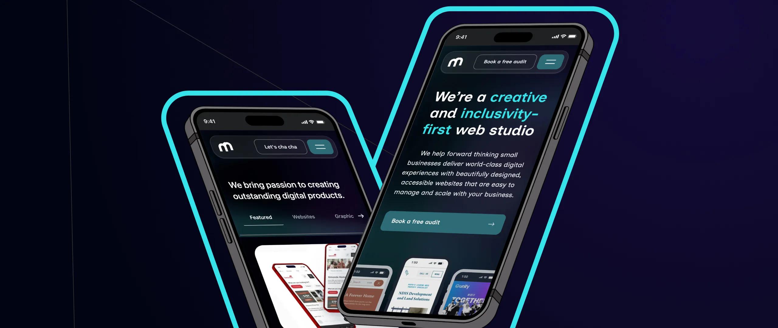
The way we access the web has changed. These days, more people are browsing, shopping, and engaging with websites than ever before. If your website isn’t built with mobile users in mind from the start, you could be missing out on valuable traffic and engagement. At Mintyy, we believe mobile-first design isn’t just good practice—it’s a core part of creating digital experiences that feel effortless and accessible.
Mobile-first design is exactly what it sounds like: designing your website for mobile devices before scaling up to tablets and desktops. It’s about starting with the smallest screen and prioritising the most essential elements first. This approach ensures your content stays clean, focused and usable—no matter how your audience chooses to visit your site.
Mobile browsing now makes up over half of all web traffic globally—and that number keeps growing. Whether it’s looking up a service, booking an appointment, or making a purchase, people expect to do it quickly and easily on their phones. If your site isn’t built to deliver on that expectation, you risk losing your audience before they even begin.
Google ranks mobile-friendly websites higher in search results. That means a mobile-first website doesn’t just look good—it performs better, too. Fast load times, clean layouts, and intuitive navigation all contribute to a stronger SEO foundation. Tools like Google’s PageSpeed Insights or Mobile-Friendly Test can show how your site stacks up.
A well-designed mobile experience helps users find what they need quickly and easily. It reduces frustration, increases engagement, and often leads to better outcomes—whether that’s a booking, an enquiry, or a sale. By stripping back the clutter and focusing on what matters, mobile-first design leads to faster, clearer, and more enjoyable journeys.
When you start with mobile, you naturally design for simplicity—and that’s a huge plus for accessibility. Clean layouts, large touch targets, and clear content help ensure your site works for everyone, including people with disabilities. At Mintyy, we see accessibility and mobile-first as two sides of the same coin—both essential to great digital experiences.
Technology moves fast. By designing mobile-first, you’re not just responding to today’s trends—you’re preparing for tomorrow’s devices and screen sizes. A responsive, flexible site is easier to maintain and scale, giving your business a digital presence that grows with you.
At Mintyy, we bake mobile-first thinking into every stage of our process. From early wireframes to final launch, we prioritise clean design, fast performance, and accessibility across every device. The result? Bespoke digital products that not only look beautiful but feel effortless to use—wherever your audience finds you.
Mobile-first design is more than just a design technique—it’s a mindset that puts your users first and your business ahead. If you’re looking to refresh your website or start from scratch, it’s time to consider mobile as your foundation.
Let’s build something fresh together. Get in touch to find out how we can help bring a mobile-first mindset to your next project.

We acknowledge the Whadjuk Nyoongar people as the Traditional Owners of the lands and waters where Perth city is situated today, and pay our respect to Elders past and present.
Let's take an honest look at who excels in web, along with a dynamic tool to help you calculate exactly what kind of agency your business actually needs.
In an age of AI, people are bypassing traditional search bars entirely, choosing instead to ask AI engines to synthesise the research for them.
Choosing a web designer in Perth shouldn't be a gamble. It should be an investment in a partner who understands the technical rigour required to win in 2026.